Desktop, side by side
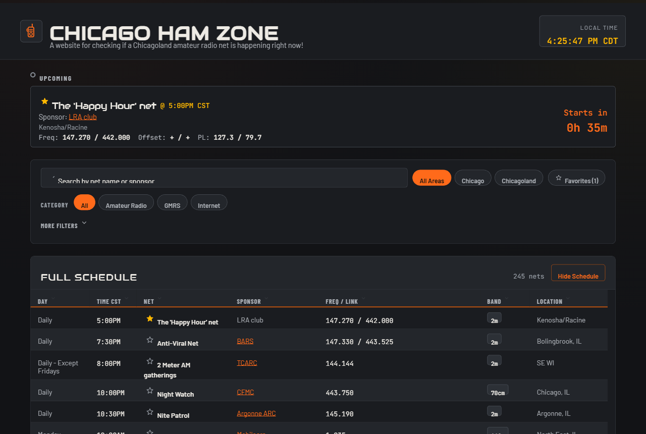
The original site was passable. It had a full-width gradient hero, an upcoming card, and all of the nets as unfilterable cards. There were three filters: all, Chicagoland, and Chicago. The redesign kept the core gray and orange color palette, along with the Audiowide and Barlow type faces. As for the new stuff, I changed the cards to be sortable, filterable, and replaced the list of cards with a zebra striped table for better readability. I added two new filterable categories including: day and band frequency.
I added a favorite option for people to save their favorite nets (as local storage no need to complicate things). This add a small layer of customization for each user. Lastly, if a net is currently happening in addition to showing up on the top of the page as a card, it is also highlighted on the net table.
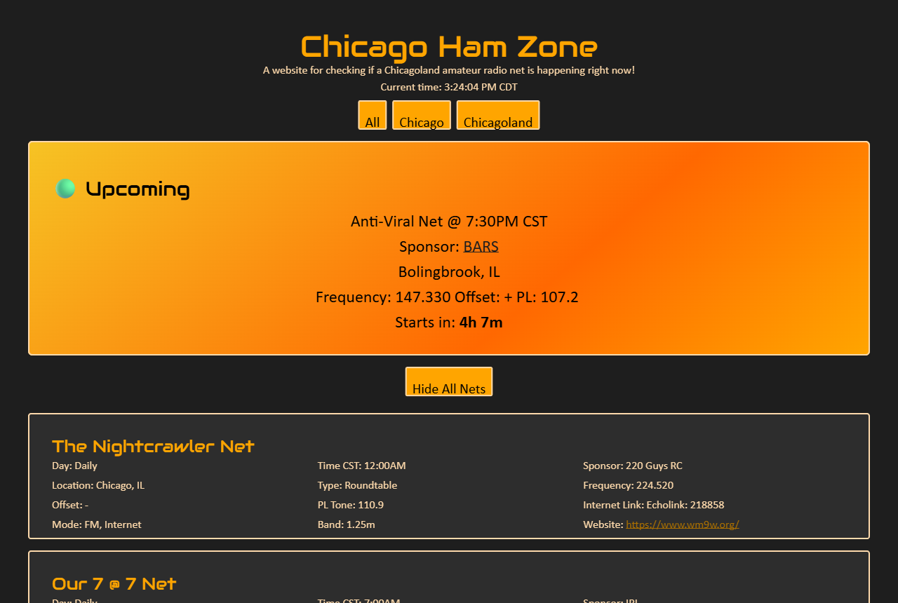
 Before
After
Before
After
Mobile, side by side
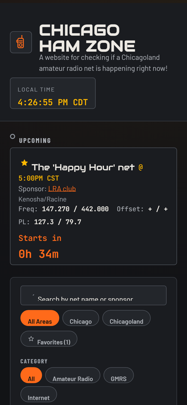
The original site was responsive but mostly because it was so simple. For the redesign, I opted for the nets to show up as stacked cards with a label on every field, so the data stays legible on a phone. The table view with horizontal scrolling was not a good way to view information. The filters are toggleable for visibility saving valuable space for the mobile view.
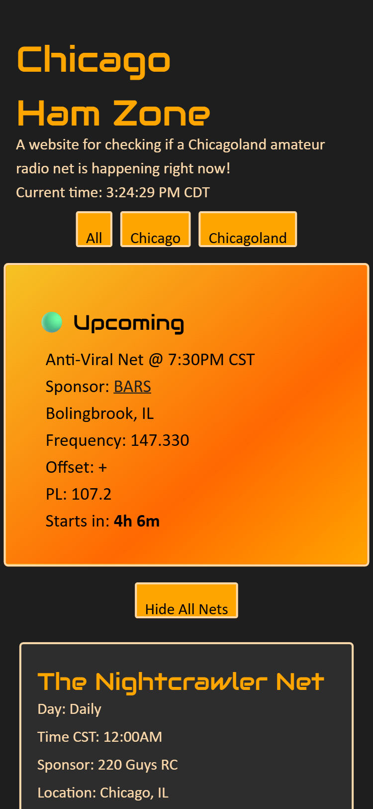
 Before
After
Before
After
The data problem
The redesign expands coverage to 245 nets across three categories (Amateur Radio, GMRS, and Internet-based).
The redesign also includes a scheduled GitHub Action to pull information from the spreadsheet. Making sure the data stays fresh.
Conclusion
The redesign makes this website not only useable by a broader user base but also lets folks save what nets they enjoy. Better filtering means that they can precisely see when nets are happening. All in the hopes this tool will help more people get involved in their local nets.